Tuesday 26 February 2013

TASK THREE: PYLON PRESS

Pylon Press BlogThe Pylon Press Is another brief that offers a lot of interesting possibilities.
Although the brief specifics are not yet available The task offers lots of potential for an artistic free reign. The 24 page A5 booklet is lengthly enough to cater for a long story with the possibility of a detailed narrative that could also include additional text.

Due to the open nature of the brief any concept can be conceived  such as a specific story, set of zines or illustration.

Personally If I choose this brief I would favour a 24 page story, with accompanying text. I took a 'creative writing' module last year and also on my Exeter college course prior, and have a few ideas in the way of a story line. Some of the stories are things that have happened to me in the different jobs I have worked, some form my different travels and other just ideas of my own.

I had a chance to explore some of these ideas, stories and characters during this module but always thought that some of them could be applied in the form of a illustrated story or book. The Pylon press brief would allow me to develop some of these different ideas to a more refined form.


TASK THREE: CHOICES: 99 DESIGNS


99 Designs is a design community where an illustrators, graphic designers, or web designers can compete in competitions for different commissions. There is a three level judging process that goes through a preliminary round of judging then onto finalists and then a 'final round where the winning design will be chosen. The competitions typically last between 3-7 days with sometimes over 100 entrants per competition and dozens of competitions to chose from. Some of the commissions include Book cover design, illustrations for an explanatory pamphlet to a logo design for a tech website. The prizes range from £150 to £1000 and over.

The first step is to join the community and create a profile, and then start looking for competitions to enter. There is no limit to the amount of competitions that you can enter but there is some ground rules.

You are not allowed to submit any copied or unoriginal designs (shocker!), you are not to copy the designs of any current entries and you are not allowed to divulge any of the information regarding any of the competitions. This makes It a little hard to document my research of such a competition though. Although putting my research for any of these competitions on a blog puts me at risk at getting banned from the community, i'm sure research in the form of a word document or sketchbook will be fine.

At the moment there are several competitions I am looking at. They all fall under the following catagories:

Book Cover Design.

Logo's. 

Magazine cover design.

Although I'm more than aware that the purpose of this brief is to lead us onto the most suitable path to a future in illustration and build up a relevant portfolio, It would be nice to enter some competitions that I actually have a chance of winning. I'm not pessimistic, but I am realistic. Competitions like Penguin, Puffin, and MacMillian are great, prestigous competitions but the entries are somewhere in the thousands and the actual probability of winning such a competition is minute. Also The type of subject matter touched in these type of briefs is not necessarily akin to the kind of jobs that  will be aiming to get in the first few years, post graduation. In addition to this, all three of these aforementioned briefs have a very long turnover, and do not realisticly represent the timeframe given to the type of commissions they are. For example entrants have many months to tackle the penguin design award brief but the majority of commissions I have researched in  the same field will typically be between 3 days and 2 weeks.

I am at a stage where I have started to get regular commissions and only really want to look for other competitions and competitions that have some resemblance to the work i am currently doing. this makes '99 designs' a viable resource for a potential multitude of commissions.


    TASK THREE: CHOICES: ONE: PUFFIN DESIGN AWARD


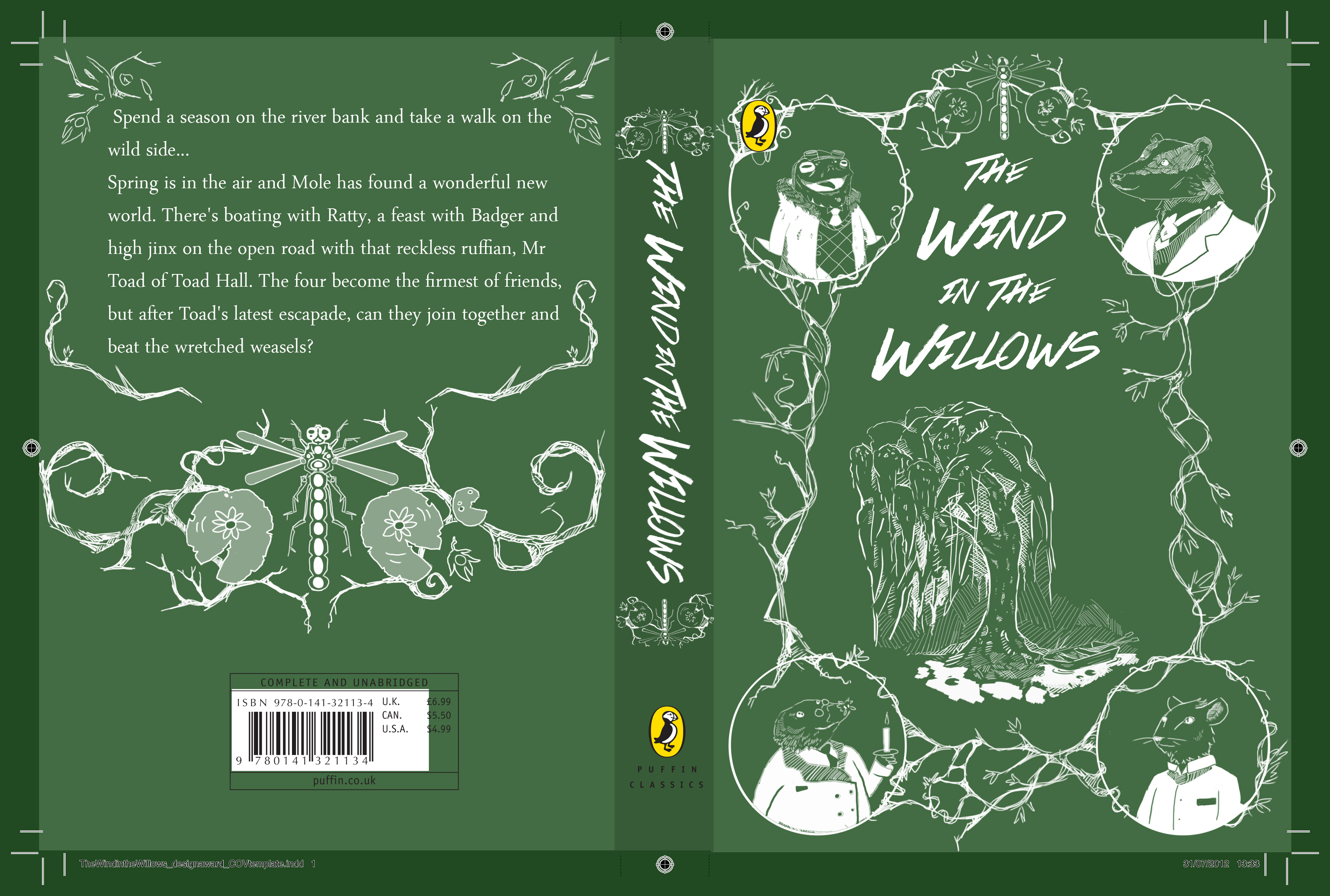
    PUFFIN DESIGN AWARD: THE WIND IN THE WILLOWS.

    I am Interested in this brief after completing my entry for this years Penguin Design Award for 'The Big Sleep'. With one Book cover design under my belt I am very keen to get more commissions and submissions completed for more potential publications. Despite the extremely competitive nature of this competition I would very much like to enter It.

    The Wind in the Willows is a text that I am familiar with and I like the idea of being challenged to come up with a new and fresh idea of the newest publication  of this childhood classic. The important note to be taken from the brief are to have an imaginative and original concept, to execute the design with a strong focus/use of typography and to understand the subject material and market place of book publication. 


    These are just a few varied designs from previous publications as well as entries to this year competition. The focus seems to be very character driven, in most cases, maybe a design that does somehow not include the characters could be considered more original.  


    TASK ONE: Jacqui Oakley LP Commission (Two Crown King)


    This commission is for the rock band 'Two Crown King' By Illustrator Jacqui Oakley in July of 2011.


    The process involved an initial pencil drawing and then acrylic painting over the top (using experimental shapes and colours.


    After the acrylic paint he did some inking that brought out the textures you can see in these photographs.


    Designer Jamie Poly assisted the production by using the lion design shape and applying it to
    the inside labels and inner sleeve of the LP gatefold.


    This commission really caught my eye, as I recently did something similar, but on a much smaller scale.  I have done two pieces of artwork for an album in the last few months, one for the LP and one for the CD release. I chose this example because I have a very keen interest in doing more music album related projects.

    The process I used for my own LP and CD commission was a little different but along the same lines as this. Unlike this example I was given general instructions to follow on both two commissions. The first CD cover commission I spent a lot more time with precesses and experimentation so that when the band asked my to do a separate commission for the same album i already new the material and style of the band and the type of artwork/design that they would require.

    The first commission i used a very hands on approach (much like the artist has in this design, in the second commission I send just one mock-ip illustration done purely in photoshop, and then a final version after that that just needed a slight tweak.

     I enjoyed the communication process in both instances of swapping emails with the leader of the band to make sure everything was as they wanted. I also really enjoyed submersing myself in the music of the band and have a good time researching their website, influences, ect.

    I believe the more of these commissions i get the more I will be able to refine my style and improve in my professionalism.


    Friday 22 February 2013

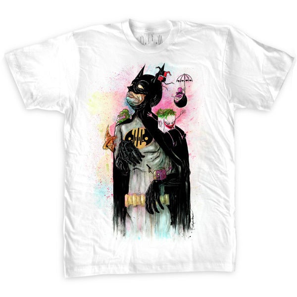
    TASK ONE: 'TONIGHT, TO KNIGHT (T-SHIRT DESIGN) BY ALEX PARDEE


    This T-shirt design was not designed for a specific commission but for the artists website. It would have been printed by a third party. The genre is pop culture/ comic characters.
    The Design caught my attention and reminds me of a recent brief I read, the brief was to illustrate one or more of your favourite childhood cartoon or T.V characters only in a state of old age. This rendition of Batman looks old, weathered and decrepit. circling around him are a number of characters from various Batman movies, comics and video games. The way they are drawn is interesting too, they seem to be like a collection of miniature versions of themselves tormenting the Batman Character in his withering state.

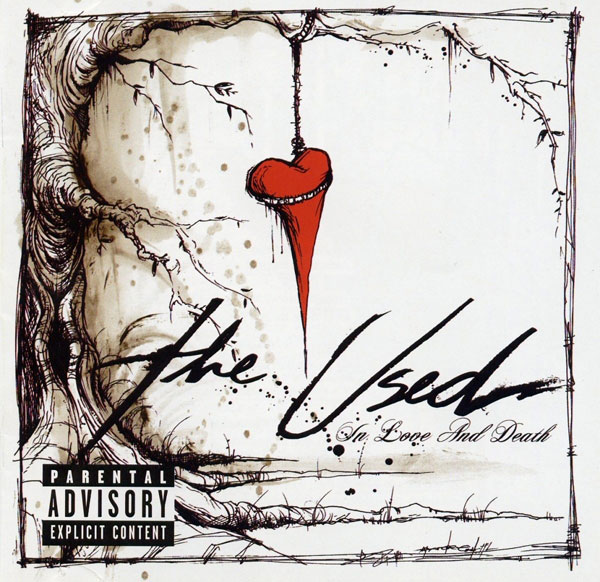
    I realise that as this piece was made for personal self-production and not for a specific client that the list of questions do not really apply but I had a further look at Alex's work to get an Idea of some of the kind of clients he gets. Among them were skateboard companies, as well as designing the album art for the band 'The Used'. The later translates more to my own work, as i have already done one album art commission and am presently in the process of completing another. 


    I love doing artwork for LP's and CD covers. I am completing a second design for the LP release of the album "Scent of a Wolf" by the Montreal based rock/jazz fusion band 'Alexiemartov'. My Design for their Album cover was greatly approved and the process of listening to their music and communicating ideas back and forth with the band was a great and interesting experience. After this experience I can honestly say I would like to work on a similar project. 


    This example first example is one of the designs from one of Alex Pardee's few commissions for the band 'The Used', The Album was titled 'In Love and Death' relesed September,


    Wednesday 20 February 2013

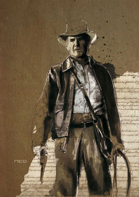
    TASK ONE: 'INDY' MIXED MEDIA ILLUSTRATION BY FLORIAN NICOLLE


    This awesome mixed media movie art piece was a commission for Warner Brothers studios for a poster and magazine article for the premier of 'Indiana Jones and The Kingdom of the Crystal Skull in May 2008. The genre for this work is mixed media and movie/advertising illustration. 

    To work for this client would be a dream job for me. Everyone says the phrase "I love movies" but ask them what year their favourite movie was released and they probably wouldn't have a clue. I have a storng interest in movies which was once bordered on an  obsession.  The notion of mixed media is very intersting to me and is something that I would love to explore over the course of this module. Personally I can see myself mixing paper collage with digital drawings to make unique designs. 

    I would really like my work t be viewed by the exact type of audience that this particular client could offer. Essentially people with a very keen interest in cinema. This would push me really hard to come up with a unique and clever design to gain the interest I need to gain a following as an illustrator. 

    The techniques, mixed media and themes involved with this piece of work all strongly appeal to me. The work is more unique than most of the other artists I have looked at thus far.  

    TASK ONE: MARIO GOTZE ILLUSTRATION BY DAVID DESPAU FOR '11 FREUNDE' MAGAZINE 2012


    This cover art by David Despau was a commission for the German Footballing magazine '11 Freunde' in July 2009. He has published work for this client since this edition (118). The genre again is portraiture with the focus on on a football player. The artwork is drawn in pen and ink then touched up in Photoshop.

    This client would be desirable to work with considering my interest in football and portraiture. The artwork itself has a technical look with the straight cross-hatching and unfinished style. (see right side of face). I like the concept of artwork that is half finished in appearance as this style can be very effective when done properly. I have i the past done drawings of a similar vein before I started focusing more heavily on straight digital portraits. 

    The Audience would be quite large and certainly very broad for this client and the exposure could be extremely beneficial.  Football magazines are read by predominantly men but of a broad age category  anything from 13-60+ which is better then a fixed age category. The illustration works well. It's not to sterile, has some good graphic elements and is confident without being too neat and tidy. It suits the type of magazine well I think. well constructed. This style of work is not dissimilar to some of my own and i'm confident that with minimal practice that IO could create a piece of a similar vein and quality. This piece although not particularly unusual or interesting, is well constructed and works very well with the specific client. 


    TASK ONE: 'JOHN WILLIAMS' BY GABRIEL MORENO FOR WALL STREET JOURNAL '12


    This creative illustration by the talented Gabriel Moreno of the famous film composer John William was a commission for the Wall Street Journal in December of 2012. This commission would fall under the category of editorial illustration with other themes such as film and music involved. 

    I would love to work with this client but due to the highly elitist nature of the client I don't consider it to be an option for the near future, hopefully in several years time I will get to work for such a client. I find the illustration particularly inspiring, from the subject matter to the style and the colour palet. I like the way the artist has incorporated four small illustrations from iconic scenes in the movies from which the composer has made the musical score. In addition to the two portrait-like illustrations of the composer Gabriel has includes reference form Indiana Jones: The Temple Of Doom', Two of the the 3 Star Wars movies, 'E.T the Extra Terrestrial' and one of his more recent pictures 'War Horse'. My only critical comment iss that He has incorporated two star wars images when there are a plethora of other iconic film that John williams did the score for. 'Jaws', 'Jurassic park, 'Hook' and 'Empire of the Sun' come to mind. Perhaps he is a 'Star Wars' fan.

    The audience for the 'Wall Street Journal' is not a one that i typically think off when I consider my own work. It bis more of an older, professional and business orientated clientele that read this magazine. having said that, It is the most widely circulated magazine in the United States and with that comes  huge exposure. Like lots of Moreno's work I find this piece Aesthetically outstanding. Composition has obviously been painstakingly considered in the drafting stage of this piece. The work is within my comfort zone but It is of a very high standard and I expect My work to develop for some time before I can produce illustrations of a similar calliper.  The work is slightly unique as It fuses two connected things into one single illustration, but i wouldn't say the work is unusual. 


    TASK ONE: 'STEPHEN GRAHAM' BY MATHEW HOLLINGS FOR 'NUTS' MAGAZINE


    This awesome digital portrait of the the actor Stephen Graham (Snatch, This is England, Boardwalk Empire) is by the Artist Mathew Hollings for 'Nuts' Magazine. The brief was for him to Illustrate the Character using colours from the Union Jack Flag. The colours are used to symbolise the often overly patriotic side to many of the characters he has played in his films. The red splatters are a hint at the violence that is also prevalent to his characters, most recently 'Boardwalk Empire's' Al Capone. The commission was completed for the March 2012 issue of 'Nuts' magazine (UK) The genre can be classified as film related/ character portraiture.

    'Nuts' Magazine is a very 'Ladish' type of client to work for but at the same time I think they would be a lot of fun to work for. the faculty would be of a 18-40 age category I would imagine and the popular themes in the magazine would prove interesting commissions. As a fan of portraiture art and almost anything film/character related this image (among many of Mathew Hollings) caught my eye immediately. Not only do I like these influences but I like the reference to  his typecast roles, which makes the piece more unique and ultimately work better. It would be fair to say that I have a distinct interest in producing work like this in the future.

    Nuts Is a magazine that is read by a young and predominantly male audience but this is not necessarily a bad thing, as I produce work that is more relevant to a younger age group. The Work falls well within my comfort zone and is certainly aesthetically pleasing. The work is relatively simple but the additional character references are of interest to me and would not be missed buy anyone who has seen the movie or some of the actors previous performances.